
How to Reduce Colors Without Making Pixel Art Look Muddy
Learn how to reduce colors while protecting contrast, skin tones, materials, and focal points in converted pixel art.
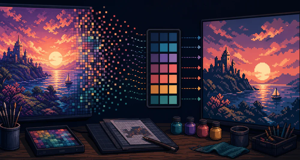
Reducing colors should make pixel art clearer. When it makes everything brown, gray, or flat, the problem is usually not the idea of a limited palette. It is the order of operations.
Clean the shapes first. Reduce the palette second.
What color reduction actually changes
A photo may contain thousands of slightly different RGB values. Many are camera noise, compression, soft shadows, or reflections. Color quantization groups nearby colors into a smaller set.
The difficult part is that “nearby” mathematically is not always “equivalent” visually. Two dark colors may belong to different objects. A small warm highlight may matter more than a large neutral wall.
That is why the preview matters more than the number.
Begin higher than your target
If you want a 16-color look, do not start at 16. Begin around 32 or 48 colors and inspect what changes as you step down.
Watch these areas:
- the lightest highlight;
- the darkest useful shadow;
- the edge between subject and background;
- skin, foliage, or any material with close neighboring hues;
- the main focal point.
When two important regions merge, return to the previous setting.
Preserve values before hues
An image remains readable when its light, middle, and dark groups are distinct. Exact hue is often less important.
Try squinting at the preview or viewing it very small. If the subject disappears, the value structure is weak. A bright red and bright green can still collapse into the same gray value.
Before conversion, simple edits to exposure or background brightness can help more than adding another 20 palette colors.
Give the focal point more of the palette
Not every area deserves equal color detail. A portrait background can use two or three broad colors so the face can keep more subtle transitions. A product image can simplify the table while preserving the object’s material.
Crop away irrelevant areas. Every removed background detail gives the converter less competition.
This is especially important with:
- faces against foliage;
- shiny products with many reflections;
- pets with patterned fur;
- sunsets with smooth gradients.
Know the warning signs
A palette is too small when:
- separate features become one flat patch;
- midtones vanish and edges look cut out;
- highlights appear as random single pixels;
- neutral areas pick up unrelated color casts;
- the subject only reads when viewed very large.
A palette may be too large when flat surfaces shimmer with tiny variations and the result still feels photographic.
Practical palette ranges
These are useful starting points, not rules:
- 8–12 colors: bold icons, silhouettes, simple objects;
- 16–24 colors: avatars, portraits, clean game assets;
- 24–48 colors: landscapes, pets, detailed products;
- 48+ colors: gentle pixelation with more photographic shading.
Use PixelTool’s color control gradually. A jump from 64 to 8 tells you only that the result broke, not where it broke.
Check the export on real backgrounds
Colors are relational. A palette that looks balanced on the editor’s dark surface may feel weak on a white page or saturated game scene.
Export a test PNG and place it where it will actually be used. Check it at 100% scale. If the darkest tone is not dark enough, the whole image can feel foggy. If every highlight is near white, the materials lose character.
The smallest palette is not the goal. The goal is a palette where each remaining color has a job.