
Photo to Pixel Art: Settings That Keep the Subject Recognizable
Learn a practical photo-to-pixel-art workflow that preserves faces, silhouettes, and important details without keeping every color.
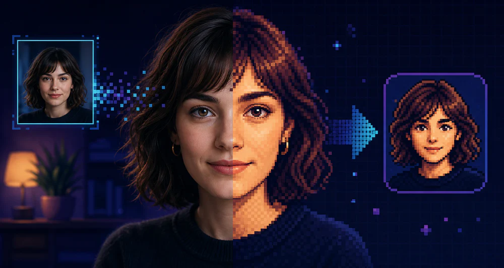
A photo can survive a surprising amount of simplification. The trick is deciding which information must stay. Faces need the line of the jaw and the spacing around the eyes. Products need a readable silhouette. Landscapes usually depend on value groups more than small texture.
That is why a good photo-to-pixel-art conversion starts before you touch the pixel size slider.
Start with a suitable source
Choose an image with one obvious subject and clean separation between light and dark areas. Soft studio light works well. Busy backgrounds, tiny faces, heavy motion blur, and harsh filters make the conversion harder.
Crop first. If the subject occupies only a quarter of the image, most of your available pixels will describe the background.
For portraits, I usually keep:
- the full head and a little shoulder space;
- both eyes large enough to remain separate;
- a simple background with a different brightness from the hair.
Find the pixel size before reducing colors
Open the image in the PixelTool editor and begin with a moderate block size. Do not jump straight to the chunkiest setting.
Increase the block size until minor skin texture, fabric grain, or camera noise disappears. Then stop one step before the identity begins to collapse. Watch the outer contour, not individual eyelashes.
A useful test is to shrink the preview on screen. If you can still recognize the subject at thumbnail size, the large shapes are doing their job.
Reduce the palette in small steps
Color count changes the image differently from pixel size. Large blocks simplify geometry; a small palette simplifies light and material.
Start around 32 or 24 colors. Move toward 16 if the result still feels photographic. Portraits often need a few neighboring skin tones, while a graphic object may work with eight colors or fewer.
Stop if:
- the eyes merge into the surrounding shadow;
- hair and background become one shape;
- two materials that should feel different use the same values;
- highlights turn into isolated bright dots.
More colors are not automatically better. A controlled palette often makes the result feel deliberately drawn.
Protect contrast around the subject
The most common failure is not low resolution. It is weak separation.
If dark hair disappears into a dark wall, lighten the background before conversion or choose a tighter crop. If a pale object sits on white, add a neutral backdrop. The converter can group colors, but it cannot invent a boundary that the source never had.
For faces, check the shadow under the chin, the bridge of the nose, and the hairline. These few transitions carry more likeness than dozens of tiny color changes.
Export at the right scale
Keep the working image small enough to reveal the pixel structure, then export at a practical display size. A 128-pixel result can be displayed at 512 pixels if it is scaled by an exact multiple with nearest-neighbor rendering.
Use PNG for social posts, avatars, and most web work. Use SVG when the artwork needs to sit at several sizes without soft browser scaling.
A repeatable starting recipe
For a head-and-shoulders photo:
- Crop to a square or slightly vertical frame.
- Raise pixel size until skin texture disappears.
- Set the palette near 24 colors.
- Lower it toward 16 while watching the eyes and hairline.
- Compare the preview at full size and thumbnail size.
- Export only after the silhouette reads clearly.
Treat these values as a starting point, not a preset. The best settings depend on how much of the frame the subject occupies and how strong the original lighting is.
The goal is not to preserve every detail. It is to keep the few details that make the subject unmistakable.